At its core, a Gantt chart is a fantastic tool for getting a bird's-eye view of a project timeline. The big win is visual clarity. But, and it's a big but, their main weakness is how quickly they can become overly complex and a real headache to manage as a project grows. This balancing act between visibility and complexity is the key to understanding where Gantt charts shine and where they fall short.
What Is a Gantt Chart?
Before we jump into the pros and cons, let's get on the same page about what a Gantt chart actually is. It's more than just a fancy bar chart; think of it as the visual story of your project's life. It quickly answers the most important questions: what needs doing, when does it need doing, and how do all the pieces fit together?
Let's use a simple analogy. Imagine you're building a house. A Gantt chart would lay it all out for you:
- Tasks: Things like "Lay Foundation," "Build Walls," and "Install Roof" would be listed down the side.
- Duration: A horizontal bar next to each task shows how long it's expected to take—a week, two weeks, whatever it may be.
- Dependencies: You'd see a little arrow connecting "Lay Foundation" to "Build Walls." This makes it crystal clear that you can't possibly start on the walls until the foundation is solid.
This simple, visual structure is what makes it so powerful. It gives everyone a clear roadmap from the starting line to the finish.
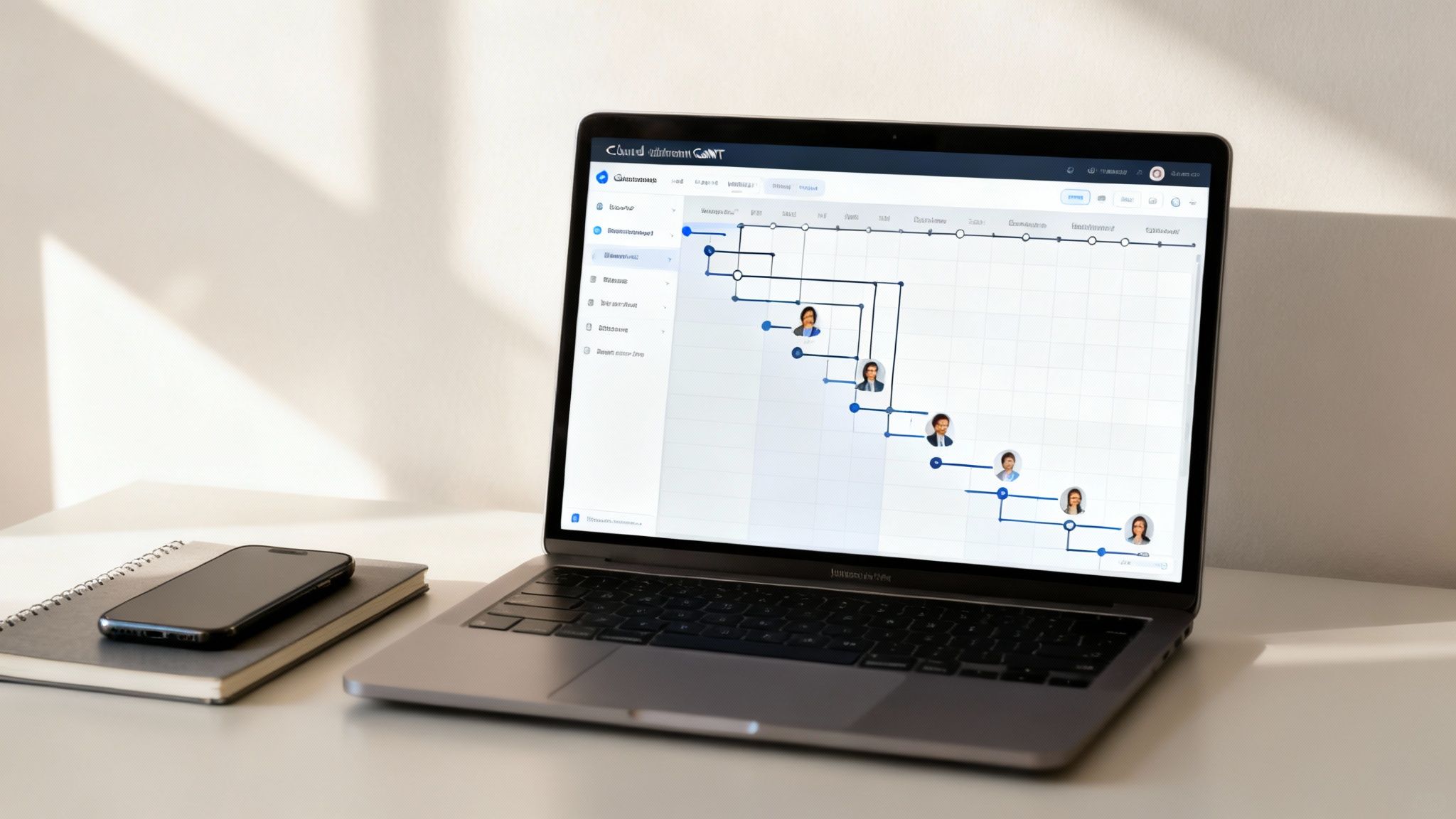
Each of these elements—the task, its duration, and its connection to other tasks—builds on the last, creating a complete picture of the project timeline.
Gantt Chart Pros and Cons At a Glance
To quickly sum up the good and the not-so-good, here's a simple breakdown.
| Aspect | Advantage | Disadvantage |
|---|---|---|
| Clarity | Gives an excellent, high-level overview of the entire project timeline. | Can get cluttered and confusing on big, complex projects. |
| Scheduling | Clearly shows task durations and deadlines, helping with time management. | Can feel rigid and be a pain to update when plans are constantly changing. |
| Dependencies | Visually maps out how tasks are related, helping to spot bottlenecks. | Can oversimplify complex dependencies, hiding the true knock-on effect of delays. |
Ultimately, this structure is the bedrock of effective project planning, laying the groundwork for how you'll assign resources and keep track of everything. Getting your head around these core concepts is the first, most important step to using Gantt charts well.
The Strategic Advantages of Using Gantt Charts
At its heart, a Gantt chart turns a dizzying list of tasks and deadlines into a clear, visual story. This is probably its single greatest strength. Instead of staring at a dense spreadsheet or digging through an endless email chain, everyone involved gets an instant, easy-to-read map of the entire project from start to finish.
This visual clarity isn’t just for looks; it’s a seriously powerful communication tool. When everyone from the client to the junior editor can see the project timeline laid out, it cuts through the noise and gets everyone on the same page. People know what their role is and, just as importantly, how their work slots into the next stage.

Unlocking Better Resource Allocation
With a bird's-eye view of every task spread across a timeline, managers can start assigning resources much more intelligently. You can see at a glance who is working on what and when, making it far easier to avoid burning out certain team members or entire departments.
This is a game-changer in places like post-production, where specialised talent and expensive gear are constantly being juggled across multiple projects. A Gantt chart helps you sidestep bottlenecks, ensuring a colourist isn't double-booked or that the main sound mixing suite is actually free when you need it. It gives you a strategic handle on production scheduling and other crucial jobs. If you want to go deeper, check out our guide on what is production scheduling.
A well-built Gantt chart makes sure your resources aren't just assigned—they're optimised. It helps you dodge the classic project pitfalls of team burnout and underused expensive assets, which feeds directly into a healthier bottom line.
Gaining Clarity on Task Dependencies
One of the most powerful things a Gantt chart does is show task dependencies. These are the critical links that show one task can't kick off until another one is wrapped up. Think about it: the final sound mix can't possibly start until the dialogue edit is locked and approved.
Seeing these connections laid out helps project managers find the critical path—that sequence of essential tasks that dictates the project's total runtime. Any delay along this path pushes back the final delivery date. Spotting these dependencies early means you can manage them proactively, stopping a small hiccup from snowballing into a full-blown crisis.
Improving Progress Tracking and Accountability
Gantt charts make tracking progress feel natural. As tasks get done, the bars on the chart get filled in, giving you an immediate visual cue of what’s finished versus what’s left. This makes it incredibly simple to see if the project is on track, running ahead, or starting to slip.
That kind of transparency builds a strong sense of accountability. When tasks, owners, and deadlines are right there for the whole team to see, it encourages everyone to take ownership of their piece of the puzzle. Beyond just one project, Gantt charts are a key part of the bigger picture, feeding into broader strategies to improve overall business efficiency. Ultimately, this clear framework leads to a more cohesive team and far more predictable results.
The Practical Disadvantages You Need to Know
While Gantt charts offer undeniable clarity, their strengths come with some serious practical downsides. These can quickly turn a helpful tool into a project management headache, especially when you're juggling complex or fast-moving projects.
Knowing these limitations is the key to using them effectively. The very structure that makes them clear can also make them incredibly rigid and cluttered.
One of the biggest complaints you'll hear is that they just get too complex, too fast. For a tiny project with maybe ten tasks, a Gantt chart is a thing of beauty. But try scaling that up to a major post-production job with hundreds of interlocking tasks—from countless VFX shots to intricate sound design—and the chart can devolve into a chaotic, unreadable mess.

This visual overload completely defeats the purpose. Instead of a clear overview, you get a source of confusion. Team members struggle to see what they're supposed to be doing, and stakeholders can't get a real sense of the project's status. The more detail you add, the less useful it becomes at a glance.
The Challenge of Rigidity in Dynamic Environments
Another huge drawback is how inflexible traditional Gantt charts are. They’re built for a linear, waterfall-style of work, where one phase neatly follows the last. This is perfect for something predictable, like building a house, where the sequence is pretty much set in stone.
But in creative fields like post-production, plans change. All the time. Client feedback might send you back to the drawing board for a re-edit, or a technical glitch could force a total workflow rethink.
Trying to update a static Gantt chart to reflect these constant shifts isn't just a pain; it's often totally impractical. One small adjustment can set off a domino effect, forcing the project manager to manually redraw the entire plan.
This rigidity makes traditional Gantt charts a poor fit for agile methodologies. When teams need to adapt and iterate quickly, being chained to a rigid, hard-to-update plan can stifle creativity and grind progress to a halt.
Oversimplifying Complex Task Dependencies
Gantt charts are great at showing simple "finish-to-start" dependencies, but they often fall short when it comes to capturing the true complexity of a project's workflow. It’s a critical limitation that many teams don't notice until something goes wrong.
For example, a chart might show that the final colour grade depends on the VFX being completed. Simple enough. But it probably won't capture the crucial details, like:
- Resource Constraints: The lead colourist is only available on specific days.
- Partial Dependencies: You could actually grade some scenes while others are still in VFX.
- External Factors: The client needs to sign off on test shots before the full grade can even start.
It's in these hidden complexities that projects often get derailed. The Gantt chart looks clean, but it can mask the intricate web of dependencies that really dictates how the project flows.
Research backs this up, highlighting that the inability to handle task interdependencies and changes is a major disadvantage, especially as projects grow. You can dig deeper into this analysis from the Association for Project Management. This is a core reason why truly understanding the gantt charts advantages and disadvantages is so critical.
Best Practices for Effective Gantt Chart Management
Knowing the pitfalls of Gantt charts is one thing, but actively steering around them is what separates a successful project from a chaotic one. A few core practices can transform your chart from a static, rigid plan into a dynamic roadmap that’s actually useful.
The goal here isn't just to tick off a list of tasks. It's to create a living document that genuinely guides your team, which means focusing on clarity, regular chats, and smart planning right from the start.
Break Down Overly Complex Projects
One of the fastest ways a Gantt chart becomes useless is when it turns into a cluttered, unreadable mess. For big projects, trying to cram every single tiny sub-task onto one master chart is a recipe for total confusion. The trick is to think in modules.
Break that massive project down into smaller, more digestible phases or even "sub-projects." Each of these smaller chunks gets its own detailed Gantt chart, which then rolls up to a high-level master chart showing only the major milestones and key deliverables. This keeps things tidy and has a few other perks:
- Maintains Clarity: Stakeholders can glance at the master chart for a quick, clean overview of progress.
- Empowers Teams: Individual teams can zone in on their specific sub-chart without getting bogged down by tasks that have nothing to do with them.
- Simplifies Updates: A change in one phase is much easier to manage and doesn't send you scrambling to rework the entire project plan.
Establish a Clear Update Cadence
An out-of-date Gantt chart is worse than no chart at all—it's actively misleading. To stop your plan from becoming a historical relic, you need a consistent update process. Decide on a rhythm that makes sense for your project, whether that’s daily for fast-moving jobs or weekly for longer ones, and make it crystal clear who is responsible for keeping it current.
A project plan is a hypothesis. It needs to be tested and refined against reality. Regular updates are how you keep your Gantt chart aligned with what's actually happening on the ground, turning it from a static picture into a live dashboard.
This discipline ensures that any delays, scope changes, or reprioritised tasks are reflected immediately. It keeps everyone on the same page, working from a single source of truth, and helps you catch the small slips that can quietly derail a project over time.
Use Dependencies and Milestones Wisely
Dependencies are the logical glue holding your Gantt chart together, but you have to use them correctly. Clearly mapping out all the "finish-to-start" links creates a realistic and logical flow for the project. This is what shows you the critical path and helps everyone see how a delay in one spot will ripple through the schedule.
Just as important are milestones. Think of these as zero-duration markers that celebrate a major achievement, like "Client Approval Received" or "Final Cut Locked." Milestones act as signposts, breaking the timeline into clear phases and giving the team important goals to aim for. Using these elements properly is the key to building a chart that doesn't just plan the work, but also clarifies the intricate dance between all the moving parts. For more on juggling team availability with project tasks, exploring effective resource management techniques can give you a serious edge.
How Modern Tools Overcome Classic Drawbacks
Let's be honest: the classic drawbacks of Gantt charts—their rigidity and sheer complexity—mostly come from a time when they were static diagrams, painstakingly drawn and updated by hand. But that’s a world away from where we are now. Today’s project management software has completely transformed them into dynamic, interactive hubs that tackle those old frustrations head-on.
This evolution is exactly why the Gantt Chart Software market is absolutely booming. Valued at £2.6 billion in 2024, it’s on track to hit £5.8 billion by 2032. That growth is being fuelled by cloud-based tools that finally make real-time collaboration a reality for remote and distributed teams. If you're curious about the numbers, you can explore the full analysis from HTF Market Insights.
The Power of Automation and Interactivity
The biggest leap forward is the shift from a static picture to an interactive workspace. Modern Gantt tools are packed with features that were once unimaginable, turning what was a simple chart into a powerful command centre for your project.
Here are a few of the game-changing advancements:
- Drag-and-Drop Adjustments: If a task gets delayed, you don’t need to erase and redraw everything. You just drag the bar to its new date, and the software instantly recalculates all the dependent tasks down the line. It's a lifesaver.
- Automated Dependency Management: Linking tasks is as simple as drawing a line between them. The software gets the relationship and keeps the project timeline logical and accurate, no matter how many changes you throw at it.
- Real-Time Collaboration: Team members can update their own progress directly on the chart. This gives managers a live, honest view of the project's health without having to chase people for status updates.
Modern Gantt software isn't just a prettier version of an old tool. It’s a complete reimagining that automates the tedious work, freeing up project managers to focus on strategy instead of administration.
This change really mirrors a wider trend we see across professional software. The digital overhaul of planning isn't just happening here; think about how social media scheduling software has turned a manual chore into a centralised, automated process. It’s the same principle.
Ultimately, these modern features directly neutralise the most common complaints, making Gantt charts a far more viable and powerful option than ever before. They help finally settle the old debate over Gantt charts advantages and disadvantages by giving you the good without so much of the bad.
Still Have Questions About Gantt Charts?

Even after covering the pros and cons, a few practical questions always pop up. Let's tackle some of the most common ones to help you get the most out of them in the real world.
Are Gantt Charts Still Relevant in an Agile World?
Absolutely, but their role has changed. Trying to force a rigid, old-school Gantt chart onto an agile sprint is like trying to fit a square peg in a round hole—it just doesn't work.
Instead, smart teams are using a hybrid approach. A high-level Gantt chart is perfect for sketching out the project roadmap and major milestones, giving everyone a clear view of the bigger picture. Then, for the day-to-day hustle within each sprint, they switch to something more flexible, like a Kanban board. It’s the best of both worlds: long-term vision meets short-term agility.
What’s the Biggest Mistake People Make When Creating a Gantt Chart?
Hands down, the most common mistake is cramming them with too much detail. A Gantt chart shines when it provides a clean, high-level overview of the timeline, the main tasks, and how they all connect.
The moment you start loading it up with hundreds of tiny sub-tasks, it becomes a cluttered, unreadable mess that's impossible to keep updated. The goal is to find that sweet spot between providing crucial information and keeping things visually simple.
Can You Just Make a Gantt Chart in Excel?
Technically, you can cobble together something that looks like a Gantt chart in Excel using stacked bar charts. But for any serious project, it's a road to frustration.
Excel charts are completely static, which makes every single update a tedious, manual chore. They also lack the essentials you get with proper software, like real-time collaboration, automatic dependency tracking, and resource management. For anything beyond a tiny, personal project, dedicated tools are infinitely more efficient.
Ready to transform your post-production scheduling with a tool that gets it right? See how freispace amplifies the benefits of Gantt-style planning while dodging all the common pitfalls. Explore our features at https://freispace.com.

